Lttr.
The Dyslexic-aiding App
Instant Clarity, Anytime
I lead the User Interface design of Lttr, an app that helps dyslexic individuals in time-sensitive situations Making comprehension instant and effortless.
My Role
User Interface Lead
Skills
App Design
Interactive Prototyping
User Research and Testing
Programs
Figma
Team Members
Finley Peplinski
Alana Banister
Justine Tijerino
Matthew Golonka
Problem
When looking at the current market for dyslexic apps and tools, we found that all of them were designed for children.
While dyslexia affects 20% of children, 15% of adults still impacted.
Showing the gap in the market for better dyslexic tools designed with teens and young adults.
Research
When surveying the dyslexic population, we found that the current tools out there were not helping.
60% call them ineffective
20% describing them as outdated
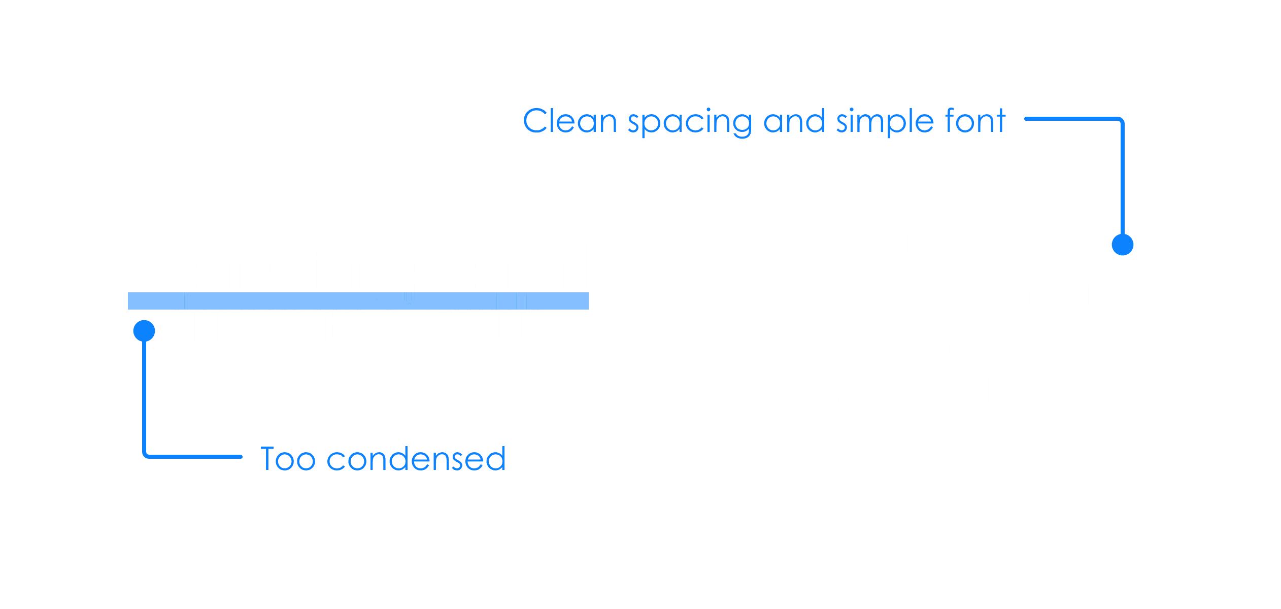
What Makes Dyslexic Friendly Design?
The simpler, the better
To create an app that supports dyslexic individuals, we focused on enhancing readability through key design choices. These include increased letter and word spacing, well-structured text layouts, and strategic bolding to improve clarity.
Ideation
Now that we have a plan, how will it look?
Following our research, we dove into ideation with crazy eights. With one minute per frame we put out all of our ideas onto pen and paper.

From these sketches, I created low-fi iterations of those Screens
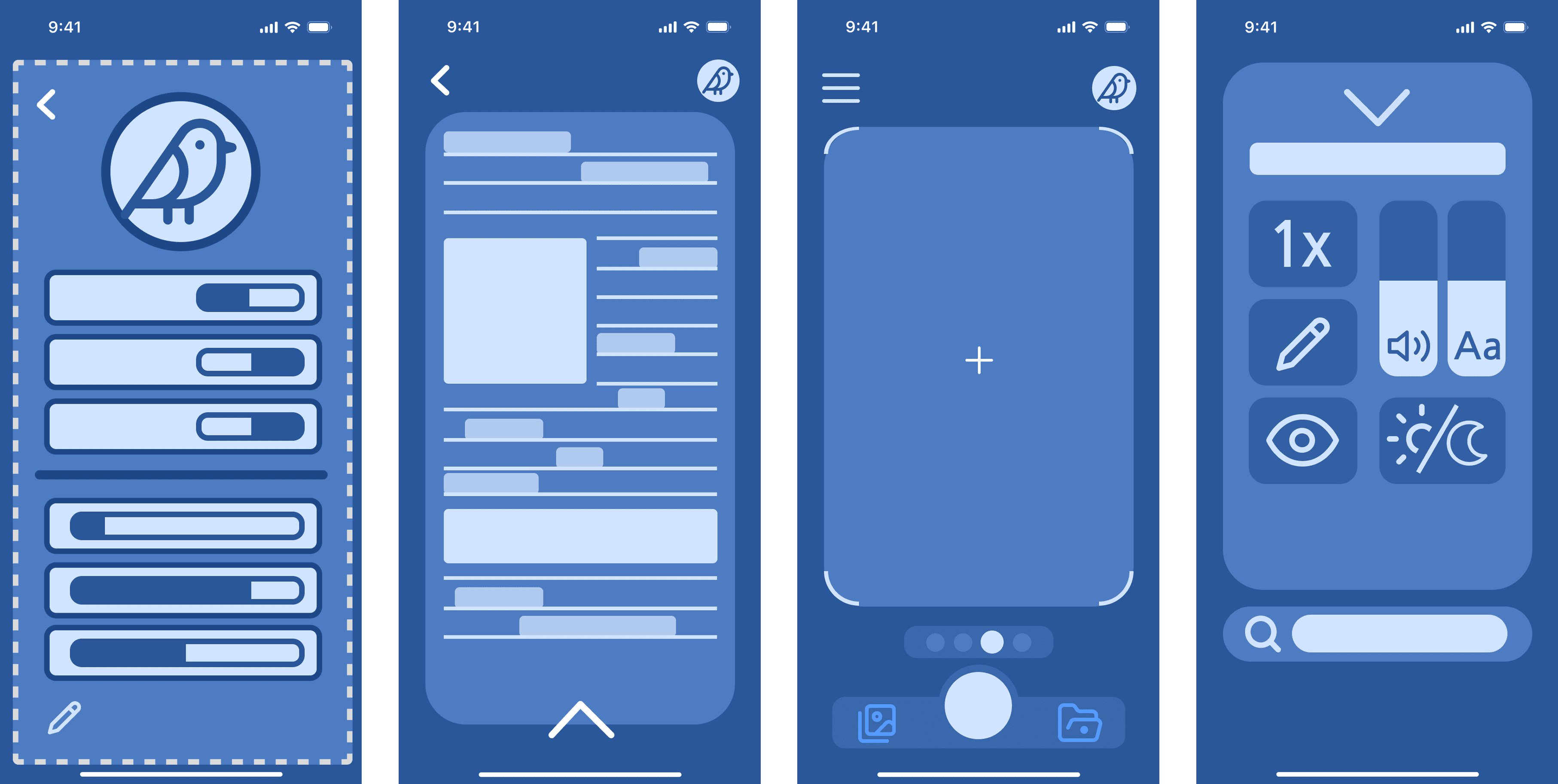
Mid-Fidelity
What does the team think?
After creating these and getting much input about location, style and general layout, I started working on the mid fidelity design used for the user testing.
User Testing
Finding the flaws
After creating these and getting much input about location, style and general layout, I started working on the mid fidelity design used for the user testing.
Polishing and refining
After identifying the pain points from the user test, we immediately brainstormed new ways to address them. Some of these included increasing the size of certain icons, refining our wireflows, and making general aesthetic improvements to ensure the design feels less childish.
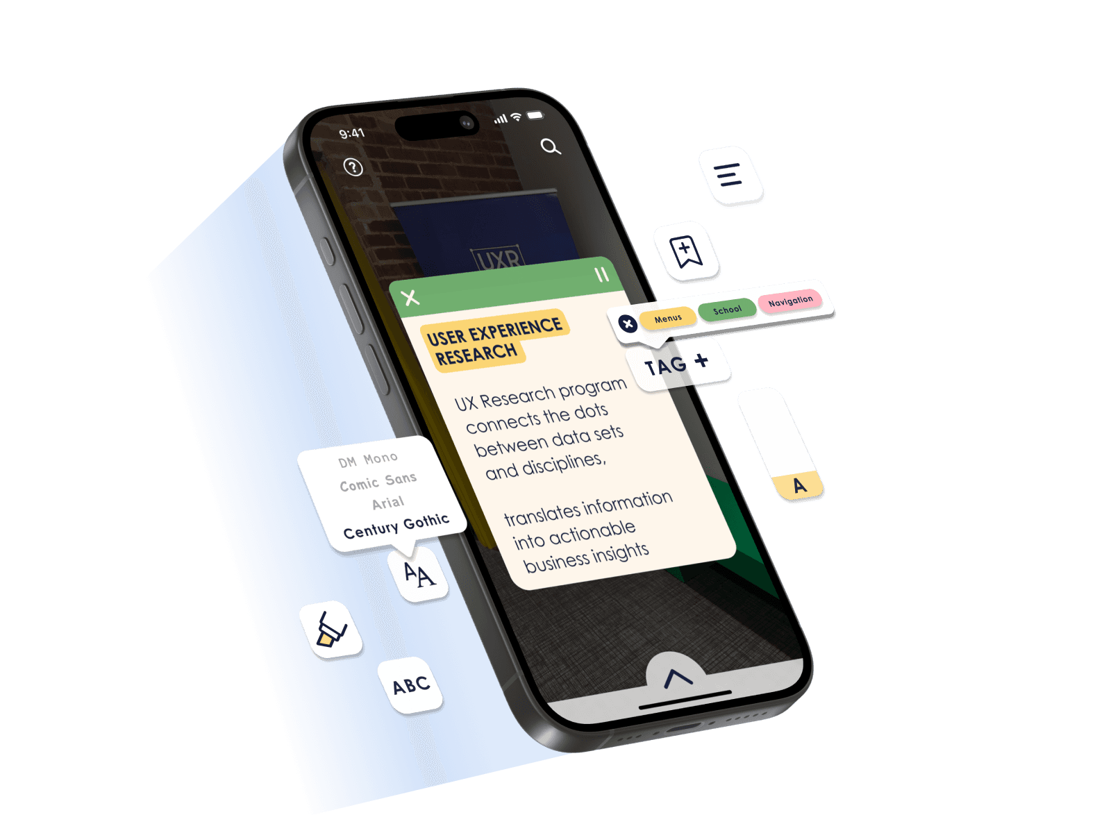
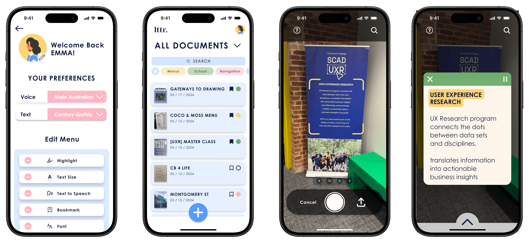
Final Iteration
Please feel free to reach out if you have any questions! Thank you for reading
Lttr.
The Dyslexic-aiding App
Instant Clarity, Anytime
I lead the User Interface design of Lttr, an app that helps dyslexic individuals in time-sensitive situations Making comprehension instant and effortless.
My Role
User Interface Lead
Skills
App Design
Interactive Prototyping
User Research and Testing
Programs
Figma
Team Members
Finley Peplinski
Alana Banister
Justine Tijerino
Matthew Golonka
Problem
When looking at the current market for dyslexic apps and tools, we found that all of them were designed for children.
While dyslexia affects 20% of children, 15% of adults still impacted.
Showing the gap in the market for better dyslexic tools designed with teens and young adults.
Research
When surveying the dyslexic population, we found that the current tools out there were not helping.
60% call them ineffective
20% describing them as outdated
What Makes Dyslexic Friendly Design?
The simpler, the better
To create an app that supports dyslexic individuals, we focused on enhancing readability through key design choices. These include increased letter and word spacing, well-structured text layouts, and strategic bolding to improve clarity.
Ideation
Now that we have a plan, how will it look?
Following our research, we dove into ideation with crazy eights. With one minute per frame we put out all of our ideas onto pen and paper.
From these sketches, I created low-fi iterations of those Screens
Mid-Fidelity
What does the team think?
After creating these and getting much input about location, style and general layout, I started working on the mid fidelity design used for the user testing.
User Testing
Finding the flaws
After creating these and getting much input about location, style and general layout, I started working on the mid fidelity design used for the user testing.
Final Iteration
Polishing and refining
After identifying the pain points from the user test, we immediately brainstormed new ways to address them. Some of these included increasing the size of certain icons, refining our wireflows, and making general aesthetic improvements to ensure the design feels less childish.